Attract.
Named for recall. Vooba: short, ownable, easy to say and easy to find, a name that works as hard in a search bar as it does on a sign.
Case study · Branding
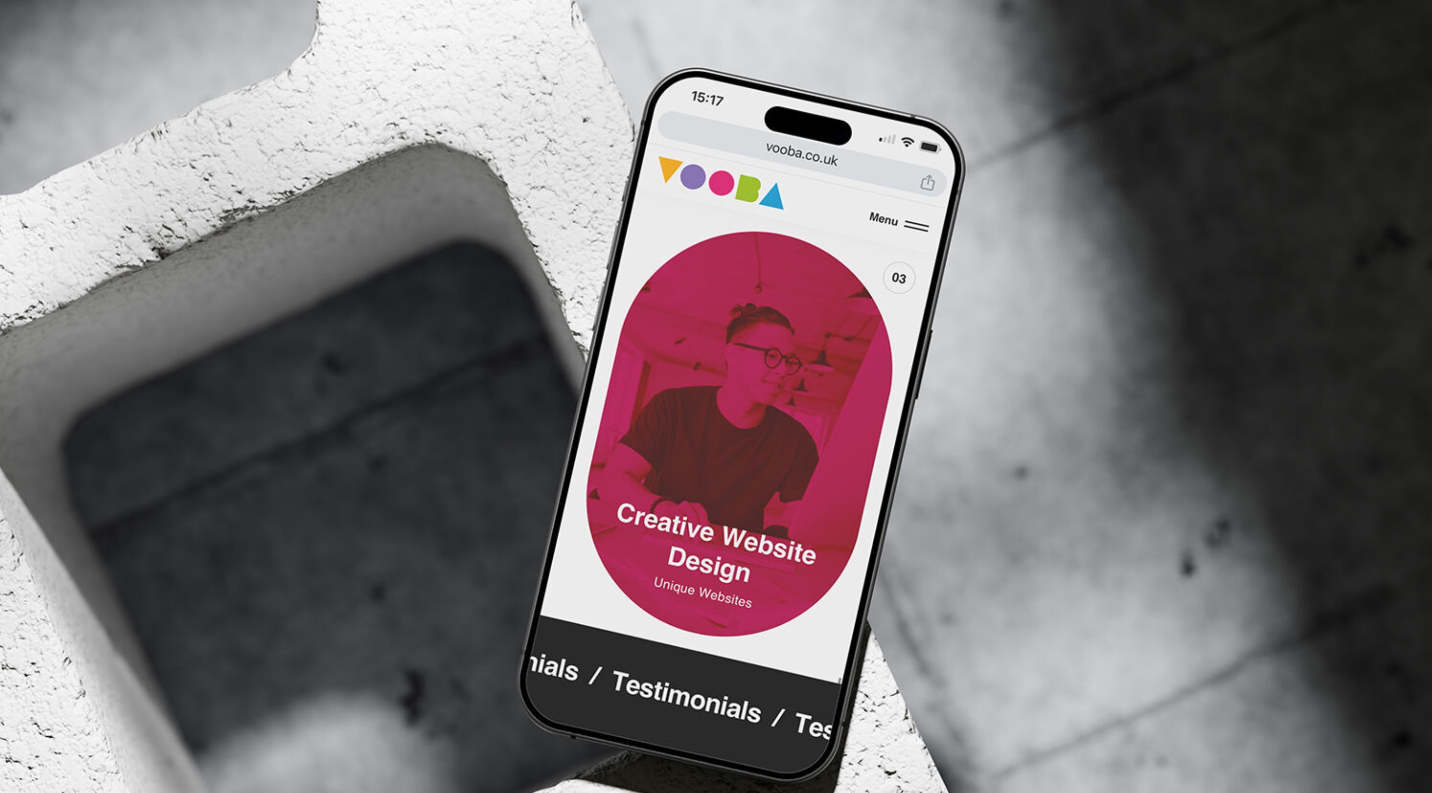
Naming
An ownable, memorable name, with the domain to match
Identity
A playful geometric system where the shapes literally spell the name
Architecture
A brand structure with room for every service, and the next one
The business had outgrown its old name. Its services had multiplied, its audience had broadened, and the brand no longer said what the company had become.
A rename is the riskiest brand move there is: everything familiar goes. The new identity had to be distinctive enough to stick on first meeting, and structured enough to carry a growing family of services.
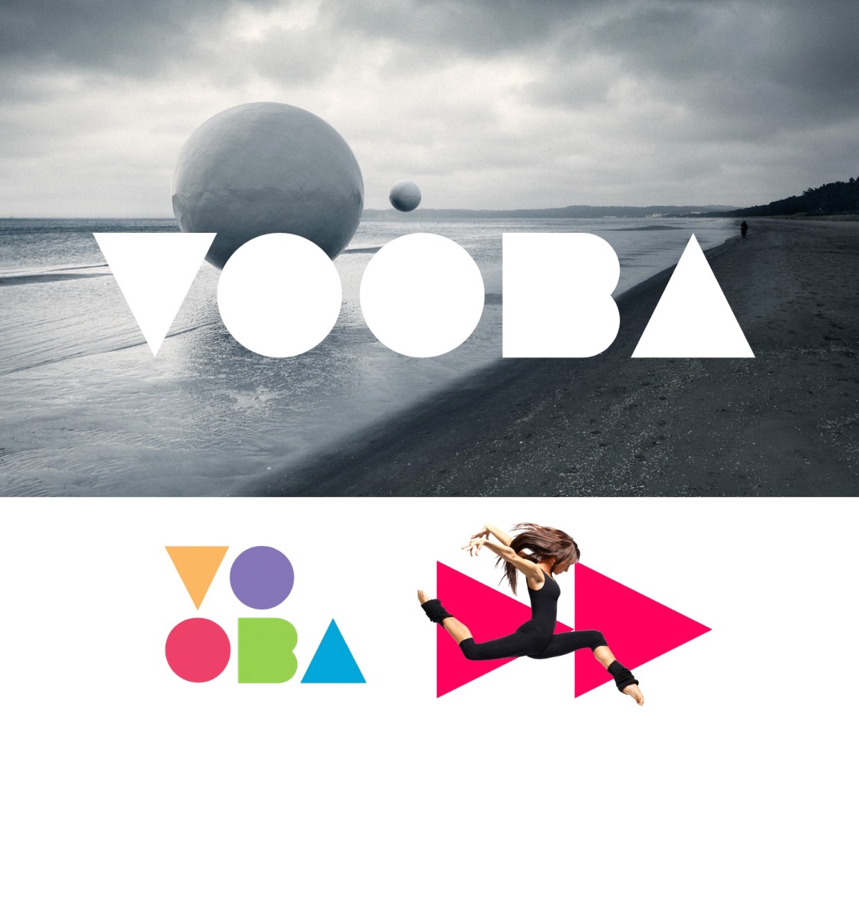
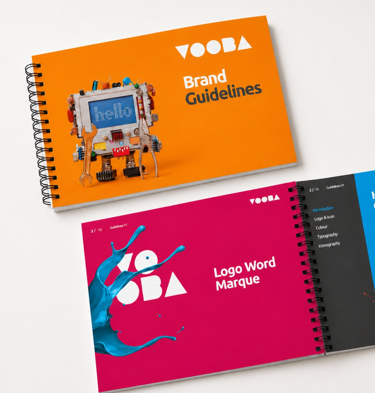
Imagery: Vooba.
The approach
Named for recall. Vooba: short, ownable, easy to say and easy to find, a name that works as hard in a search bar as it does on a sign.
Designed for play. The identity turns the letters themselves into shapes: triangles, circles and blocks that flex from website to photography to a fried-breakfast flat-lay, without losing the mark.
Structured for clarity. Brand architecture gave every service a clear home under one parent, so prospects always know what they're buying and who they're buying it from.
Built for what’s next. The system stretches: new services, new campaigns and new formats all inherit the same recognisable geometry. New name, new brand, new future.
Whether it’s a revival, a relaunch or growth from a standing start, it begins with one honest conversation.